It has become one of Australia’s most recognisable corporate logos, and it may surprise you to learn that it pre-dates the Westpac name itself.
The concept of a ‘corporate identity’ is not new: think heraldic symbols, faces on coins and images on stamps – all present an idealised version of the entity they are representing.
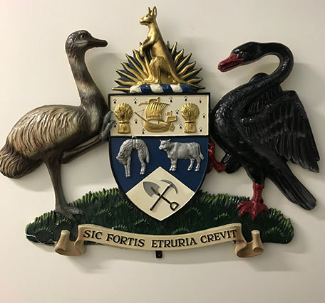
While known as the Bank of New South Wales, the bank had a crest - an elaborate piece featuring a kangaroo, a black swan (for Western Australia), the rising sun and symbols showcasing the mainstays of economy at the time: wheat, wool, beef and mining.
Its Latin inscription: ‘Sic Fortis Etruria Crevit’ – which roughly translates as ‘Thus Etruria grew strong’ – was somewhat arcane, even for the 1970s!
It was time for a change.
Bank of New South Wales crest. (Supplied)
In 1974, the bank turned to globally-renowned industrial designer and graphic artist, Pieter Huveneers to revolutionise our understanding of who we were.
Exit the stuffy, complicated heraldic symbol; enter a striking, simple - and at the time - surprising ‘W’ in bold red.
Why the W? The Bank of New South Wales was then known colloquially as ‘The Wales’ and the new logo was so successful that within 7 years, ‘W’ had achieved a brand recognition rating of over 78 per cent - meaning almost anyone who saw it recognised it.
That’s testament to Huveneers’ genius; around the same time he designed the logos for Australia Post and Myer, both of which are also still in use today.
In 1981, the Bank of New South Wales was preparing to merge with the Commercial Bank of Australia. As neither bank wanted to give up their name, their history, or, in The Wales’ case, its successful logo, Huveneers was called on again.
This time to develop a new name that would satisfy everyone.
Huveneers explained how he did it: “When selecting the new name it was necessary to take into account where the company would be based, its principal areas of operation and whether it would be desirable to include elements of both previous names, or to ‘construct’ a new name.”
“We decided to use Westpac Banking Corporation because the name implies a new attitude, a totally new look, and the Bank’s involvement in the Western Pacific region.”
Happily, it also allowed the continued use of the wonderful red ‘W’, but in a slightly deeper shade of red, and incorporating some silver elements.
Huveneers noted that “the use of silver ties in with the need to represent Westpac as a modern and sophisticated group. It is not ostentatious or pretentious – it strikes a happy medium.”
There have been slight tweaks to the red ‘W’ over its fifty years but at its core is the same message from 1974: it encapsulates the ‘look’ as much as the ‘feel’ of a company.
As Huveneers said in 1974, “these components identify a company and determines its ‘personality’, and often this public personality has a big influence on whether or not the company will be successful.”
As Westpac's head of historical services, Kim has responsibility for managing the bank's corporate archives – the largest privately held archives in the Southern Hemisphere. Having commenced her career in media and journalism, Kim found her passion in historical research and documentary heritage and, prior to joining Westpac in 2015, has held a number of archivist and research roles, and was President of the Australian Society of Archivists.
By Kim Eberhard Head of Historical Services, Westpac
10
{"topicSelector":[{"tagId":"newsroom:topics/economy","name":"economy","description":"Explore more Economy insights at Westpac Wire. Subscribe to the Westpac Wire newsletter to stay in the know.","title":"Economy","url":"/news/topic.economy/"},{"tagId":"newsroom:topics/westpac","name":"westpac","description":"Stories featuring Westpac corporate news.","title":"Westpac","url":"/news/topic.westpac/"},{"tagId":"newsroom:topics/community","name":"community","description":"Explore more community insights at Westpac Wire. Subscribe to the Westpac Wire newsletter to stay in the know.","title":"Community","url":"/news/topic.community/"},{"tagId":"newsroom:topics/banking","name":"banking","description":"Explore more Banking insights at Westpac Wire. Subscribe to the Westpac Wire newsletter to stay in the know.","title":"Banking","url":"/news/topic.banking/"},{"tagId":"newsroom:topics/covid19","name":"covid19","description":"Stories influenced by the COVID-19 pandemic.","title":"COVID-19","url":"/news/topic.covid19/"},{"tagId":"newsroom:topics/diversity","name":"diversity","description":"Explore more Diversity insights at Westpac Wire. Subscribe to the Westpac Wire newsletter to stay in the know.","title":"Diversity","url":"/news/topic.diversity/"},{"tagId":"newsroom:topics/sme","name":"sme","description":"Explore more Small Medium Enterprise insights at Westpac Wire. Subscribe to the Westpac Wire newsletter to stay in the know.","title":"SME","url":"/news/topic.sme/"},{"tagId":"newsroom:topics/property","name":"property","description":"Explore more Property insights at Westpac Wire. Subscribe to the Westpac Wire newsletter to stay in the know.","title":"Property","url":"/news/topic.property/"},{"tagId":"newsroom:topics/digital","name":"digital","description":"Explore more Digital insights at Westpac Wire. Subscribe to the Westpac Wire newsletter to stay in the know.","title":"Digital","url":"/news/topic.digital/"},{"tagId":"newsroom:topics/workplace","name":"workplace","description":"Explore more workplace insights at Westpac Wire. Subscribe to the Westpac Wire newsletter to stay in the know.","title":"Workplace","url":"/news/topic.workplace/"},{"tagId":"newsroom:topics/technology","name":"technology","description":"Explore more Technology insights at Westpac Wire. Subscribe to the Westpac Wire newsletter to stay in the know.","title":"Technology","url":"/news/topic.technology/"},{"tagId":"newsroom:topics/sustainability","name":"sustainability","description":"Explore more sustainability insights at Westpac Wire. Subscribe to the Westpac Wire newsletter to stay in the know.","title":"Sustainability","url":"/news/topic.sustainability/"},{"tagId":"newsroom:topics/scams","name":"scams","description":"Stories about the latest cyber scams news and trends. ","title":"Scams","url":"/news/topic.scams/"},{"tagId":"newsroom:topics/personalfinance","name":"personalfinance","description":"Explore more insights about personal finance, financial literacy and financial wellbeing. ","title":"Personal finance","url":"/news/topic.personalfinance/"},{"tagId":"newsroom:topics/career","name":"career","description":"Stories providing career insights, tips and trends.","title":"Career","url":"/news/topic.career/"},{"tagId":"newsroom:topics/billsbites","name":"billsbites","description":"Explore more insights from Bill Evans at Westpac Wire. Subscribe to the Westpac Wire newsletter to stay in the know.","title":"Bill\u0027s Bites","url":"/news/topic.billsbites/"},{"tagId":"newsroom:topics/social-enterprise","name":"social-enterprise","description":"Stories relevant to or featuring social enterprises.","title":"Social enterprise","url":"/news/topic.social-enterprise/"},{"tagId":"newsroom:topics/leadership","name":"leadership","description":"Explore more Leadership insights at Westpac Wire. Subscribe to the Westpac Wire newsletter to stay in the know.","title":"Leadership","url":"/news/topic.leadership/"},{"tagId":"newsroom:topics/environment","name":"environment","description":"Explore more Environment insights at Westpac Wire. Subscribe to the Westpac Wire newsletter to stay in the know.","title":"Environment","url":"/news/topic.environment/"},{"tagId":"newsroom:topics/investing","name":"investing","description":"Explore more Innovators insights at Westpac Wire. Subscribe to the Westpac Wire newsletter to stay in the know.","title":"Investing","url":"/news/topic.investing/"},{"tagId":"newsroom:topics/wellbeing","name":"wellbeing","description":"Stories featuring wellbeing trends, insights and stories.","title":"Wellbeing","url":"/news/topic.wellbeing/"},{"tagId":"newsroom:topics/agribusiness","name":"agribusiness","description":"Explore more Agribusiness insights at Westpac Wire. Subscribe to the Westpac Wire newsletter to stay in the know.","title":"Agribusiness","url":"/news/topic.agribusiness/"},{"tagId":"newsroom:topics/westpac-scholars","name":"westpac-scholars","description":"Stories featuring Westpac Scholars. ","title":"Westpac Scholars","url":"/news/topic.westpac-scholars/"},{"tagId":"newsroom:topics/politics","name":"politics","description":"Explore more Politics insights at Westpac Wire. Subscribe to the Westpac Wire newsletter to stay in the know.","title":"Politics","url":"/news/topic.politics/"},{"tagId":"newsroom:topics/fintech","name":"fintech","description":"Explore more Fintech insights at Westpac Wire. Subscribe to the Westpac Wire newsletter to stay in the know.","title":"Fintech","url":"/news/topic.fintech/"},{"tagId":"newsroom:topics/innovators","name":"innovators","description":"Explore more Innovators insights at Westpac Wire. Subscribe to the Westpac Wire newsletter to stay in the know.","title":"Innovators","url":"/news/topic.innovators/"},{"tagId":"newsroom:topics/data","name":"data","description":"Explore more data insights at Westpac Wire.","title":"Data","url":"/news/topic.data/"},{"tagId":"newsroom:topics/indigenous","name":"indigenous","description":"Explore more indigenous insights at Westpac Wire. Subscribe to the Westpac Wire newsletter to stay in the know.","title":"Indigenous","url":"/news/topic.indigenous/"},{"tagId":"newsroom:topics/payments","name":"payments","description":"Explore more Payments insights at Westpac Wire. Subscribe to the Westpac Wire newsletter to stay in the know.","title":"Payments","url":"/news/topic.payments/"},{"tagId":"newsroom:topics/history","name":"history","description":"Stories unearthed from Westpac\u0027s private archival collection. ","title":"History","url":"/news/topic.history/"},{"tagId":"newsroom:topics/podcast","name":"podcast","description":"Explore Westpac Wire\u0027s podcast series.","title":"Podcast","url":"/news/topic.podcast/"},{"tagId":"newsroom:topics/luciscall","name":"luciscall","description":"Explore more insights from Westpac\u0027s chief economist Luci Ellis at Westpac Wire. Subscribe to the Westpac Wire newsletter to stay in the know.","title":"Luci\u0027s Call","url":"/news/topic.luciscall/"},{"tagId":"newsroom:topics/startups","name":"startups","description":"Explore more Startups insights at Westpac Wire. Subscribe to the Westpac Wire newsletter to stay in the know.","title":"Startups","url":"/news/topic.startups/"},{"tagId":"newsroom:topics/currencies","name":"currencies","description":"Stories providing currencies insights, tips and trends.","title":"Currencies","url":"/news/topic.currencies/"},{"tagId":"newsroom:topics/opinion","name":"opinion","description":"Expert opinions and insights. ","title":"Opinion","url":"/news/topic.opinion/"},{"tagId":"newsroom:topics/asia","name":"asia","description":"Explore more Asia insights at Westpac Wire. Subscribe to the Westpac Wire newsletter to stay in the know.","title":"Asia","url":"/news/topic.asia/"},{"tagId":"newsroom:topics/analysis","name":"analysis","description":"Expert analysis on economic news and other trends.","title":"Analysis","url":"/news/topic.analysis/"},{"tagId":"newsroom:topics/superannuation","name":"superannuation","description":"Explore more Superannuation insights at Westpac Wire. Subscribe to the Westpac Wire newsletter to stay in the know.","title":"Superannuation","url":"/news/topic.superannuation/"},{"tagId":"newsroom:topics/IWD","name":"IWD","description":"Stories focusing on International Women\u0027s Day, on 8 March annually. ","title":"IWD ","url":"/news/topic.IWD/"},{"tagId":"newsroom:topics/rework","name":"rework","description":"Stories of businesses pivoting in the face of the COVID-19 pandemic.","title":"Rework","url":"/news/topic.rework/"},{"tagId":"newsroom:topics/veterans","name":"veterans","description":"Explore more insights about defence force veterans at Westpac Wire.","title":"Veterans","url":"/news/topic.veterans/"},{"tagId":"newsroom:topics/goodpair","name":"goodpair","description":"Explore more Good Pair stories, showing two people making a big difference together. ","title":"Good Pair","url":"/news/topic.goodpair/"},{"tagId":"newsroom:topics/10Qs","name":"10Qs","description":"\"10Qs with...\" is a series that asks leaders what makes them tick.","title":"10Qs","url":"/news/topic.10Qs/"},{"tagId":"newsroom:topics/deals","name":"deals","description":"Explore more Deals insights at Westpac Wire. Subscribe to the Westpac Wire newsletter to stay in the know.","title":"Deals","url":"/news/topic.deals/"},{"tagId":"newsroom:topics/commodities","name":"commodities","description":"Insights into commodities markets.","title":"Commodities","url":"/news/topic.commodities/"},{"tagId":"newsroom:topics/tax","name":"tax","description":"Explore more tax insights at Westpac Wire. Subscribe to the Westpac Wire newsletter to stay in the know.","title":"Tax","url":"/news/topic.tax/"},{"tagId":"newsroom:topics/regulation","name":"regulation","description":"Explore more Regulation insights at Westpac Wire. Subscribe to the Westpac Wire newsletter to stay in the know.","title":"Regulation","url":"/news/topic.regulation/"},{"tagId":"newsroom:topics/reinventure","name":"reinventure","description":"Explore more Reinventure insights at Westpac Wire. Subscribe to the Westpac Wire newsletter to stay in the know.","title":"Reinventure","url":"/news/topic.reinventure/"},{"tagId":"newsroom:topics/businesses-of-tomorrow","name":"businesses-of-tomorrow","description":"Stories featuring Westpac Businesses of Tomorrow program winners. ","title":"Westpac Businesses of Tomorrow","url":"/news/topic.businesses-of-tomorrow/"},{"tagId":"newsroom:topics/shareholders","name":"shareholders","description":"Stories relevant to Westpac shareholders.","title":"Shareholders","url":"/news/topic.shareholders/"},{"tagId":"newsroom:topics/climate","name":"climate","description":"Explore more climate insights at Westpac Wire. Subscribe to the Westpac Wire newsletter to stay in the know.","title":"Climate ","url":"/news/topic.climate/"},{"tagId":"newsroom:topics/esg","name":"esg","description":"Explore more insights on environmental, social and governance issues at Westpac Wire. Subscribe to the Westpac Wire newsletter to stay in the know.","title":"ESG","url":"/news/topic.esg/"},{"tagId":"newsroom:topics/boardwalk","name":"boardwalk","description":"A series of in-depth podcast interviews with board directors to find out what\u0027s on their minds. ","title":"Board Walk","url":"/news/topic.boardwalk/"}]}